Table of Contents
TogglePainting brick is one of the highest-impact upgrades a homeowner can tackle without ripping out materials. Whether your home needs a refresh or you’re tired of dated red brick, the right paint color can completely change your curb appeal and how your house sits in the neighborhood. The challenge isn’t finding colors, it’s choosing one that complements your architectural style, fits your landscape, and will still make you happy in five years. This guide walks you through exterior brick paint color ideas that work, explains how to assess what will actually work for your house, and covers the prep and execution that separates a pro-looking job from a patchy, peeling mess.
Key Takeaways
- Exterior brick paint color ideas must account for how light, texture, and surrounding elements change color perception throughout the day—test samples in natural light at different times rather than relying on paint store swatches.
- Classic timeless brick paint colors like soft whites, warm grays, and muted neutrals maintain resale value and complement most architectural styles, while bold colors like deep charcoal or forest green suit contemporary homes and make distinctive statements.
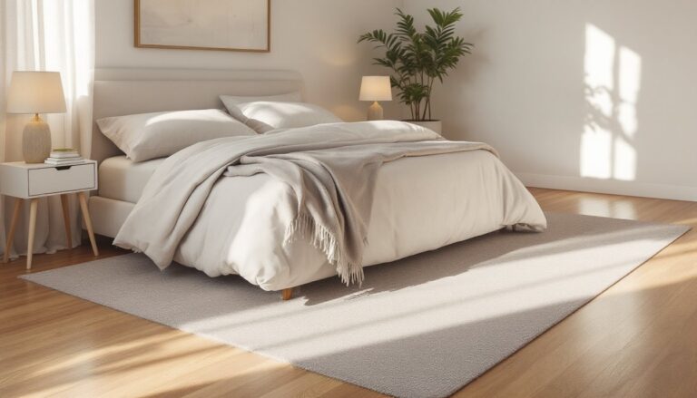
- Proper preparation is essential: pressure wash at 1,500–2,500 PSI, allow 48 hours drying time, scrape peeling paint, apply masonry primer to all bare brick, and use 100% acrylic exterior paint with a thick-nap roller for even coverage.
- Consider your home’s architectural style—colonial and farmhouse homes pair well with clean whites and soft earth tones, while Victorian homes support deeper, richer tones and modern homes benefit from bold moves like near-black or sophisticated taupe.
- Invest in premium-quality paint and use matte finishes for bold colors to keep the look current and sophisticated, and budget 350–400 square feet of coverage per gallon on textured brick surfaces.
- Match your exterior brick paint color choice with your neighborhood’s palette and existing roof, landscape, and trim to ensure the color feels intentional rather than clashing with its surroundings.
Choosing The Right Paint Color For Brick Exteriors
Picking a paint color for brick isn’t just about finding something pretty in a swatch deck. Brick absorbs and reflects light differently than drywall, what looks great in a 2-by-3-inch sample can feel totally different on a 2,000-square-foot wall. The texture, existing mortar color, roof material, surrounding landscaping, and even your front door all shift how a color reads in real life.
Start by taking photos of your home in different times of day: morning sun, midday glare, and late afternoon light. Brick color perception changes dramatically as the sun moves. A warm taupe might look golden at sunset but almost grayish at noon. Print out photos and hold paint samples against them in natural light, never rely solely on fluorescent lighting at the paint store.
Consider your neighborhood’s palette too. There’s nothing wrong with standing out, but you’ll likely want your home to feel intentional, not like it clashes with its surroundings. If every house on your block is warm, creamy white, a charcoal-gray brick might feel stunning. If you’re surrounded by varied colors, you have more freedom.
Assessing Your Home’s Architectural Style
Your home’s age and architectural period will guide which palettes feel authentic. Colonial, Cape Cod, and farmhouse styles typically pair well with clean whites, soft grays, or muted earth tones. A pale cream or weathered white keeps these homes looking historically grounded without feeling sterile.
Victorian and older brick homes can support deeper, richer tones, forest green, chocolate brown, or even muted burgundy work beautifully if your trim and roof complement them. Modern and contemporary homes benefit from bold moves: deep charcoal, near-black, dove gray, or even a sophisticated warm taupe. Midcentury homes often shine with warm sand tones or earthy ochres.
Look at the brick bond pattern and mortar joint width too. Traditional running bond with wide mortar joints can handle lighter colors without looking washed out. Tighter Flemish bond patterns and narrow joints can support darker colors because the contrast with mortar is more controlled.
Classic And Timeless Brick Paint Colors
Timeless doesn’t mean boring, it means colors that stay in style because they fundamentally work. Crisp white and off-white brick never fully goes out of fashion. A pure Sherwin-Williams Pure White or Benjamin Moore Swiss Coffee reads clean and fresh on colonial and traditional homes. These work because they’re neutral backdrops that let landscaping, shutters, and doors shine.
Warm whites with slight cream or ivory undertones, think Benjamin Moore Ivory White or Sherwin-Williams Alabaster, feel more forgiving than stark white and pair well with almost any roof and landscape. They soften the look without losing the brightness that makes a home feel clean and well-maintained.
Soft gray is another workhorse. Benjamin Moore Coventry Gray or Sherwin-Williams Accessible Beige (which leans gray-taupe) offer sophistication without commitment to a bold statement. Gray brick pairs beautifully with black shutters, charcoal trim, or white accents. It’s neutral enough to work on almost any architectural style and looks polished without trying too hard.
These classic palettes work across resale value too, research shows that exterior paint colors like appeal better than highly trendy or bold colors. That doesn’t mean don’t be bold, but it’s worth knowing if you plan to sell in the next decade.
Modern And Bold Exterior Brick Palettes
If your home is contemporary or you want to make a statement, bold brick colors deliver. Deep charcoal and near-black brick looks sophisticated and dramatic, especially when paired with white trim or natural wood accents. Sherwin-Williams Urbane Bronze or Benjamin Moore Black Panther create an almost jewel-like quality, particularly on homes with clean lines and minimal ornamentation.
Warm, earthy tones are having a moment. Sun-washed ochre, terracotta, and dusty rust shades feel natural without being retro. These work exceptionally well on cottage, Spanish colonial, or Southwestern homes. A muted rust or Benjamin Moore Caliente pairs beautifully with terracotta roofs and warm landscape palettes. These brick house color schemes often evoke a sense of grounding and warmth.
Deep forest green and sage green are gaining traction on modern homes. Benjamin Moore Salamander Green or Sherwin-Williams Evergreen Fog feel upscale and unexpected on painted brick. Pair these with stainless steel or black hardware, and your home instantly feels more designed and intentional.
Matte finishes amplify bold colors. A sheen finish on charcoal or deep green can feel slightly dated or industrial, matte keeps the look current and sophisticated. Work with your paint supplier to confirm matte options in your chosen color, as specialty finishes sometimes carry upcharges.
Neutral Shades That Never Go Out Of Style
Neutrals aren’t always white or gray. Warm taupes, greiges (gray-beige blends), and soft sand tones offer personality while remaining timeless. Benjamin Moore Hale Navy is technically a navy, but it reads as a sophisticated neutral on brick, adapting to almost any surrounding color. Sherwin-Williams Accessible Beige, even though its name, leans warm-gray and feels less sterile than pure white or gray alone.
Warm sand and khaki shades feel earthy and grounded. Benjamin Moore Wythe Cream or Sherwin-Williams Tricorn Black paired with existing light mortar creates subtle depth and texture without bold color commitment. These work on homes with existing landscaping or where you want the architecture to blend rather than pop.
Muted dusty rose and clay tones sit somewhere between warm neutrals and color. Benjamin Moore Caliente or Sherwin-Williams Urbane Bronze lean slightly warm and work beautifully in transitional homes or those with existing warm accents. They’re safe enough to feel classic but distinct enough to feel intentional.
The key to neutrals working well is light layering. Hold three to four similar samples on your brick in different times of day. The winner will be the one that feels cohesive with your roof, landscaping, and trim, not the one that looks best in the swatch deck. Exterior paint coverage is typically 350–400 square feet per gallon on brick, given the texture, so budget accordingly for sample testing and a full coat.
Preparing And Painting Brick For Long-Lasting Results
Paint prep determines whether your job lasts five years or ten. Brick that’s been exposed to weather, hasn’t been painted, or was painted decades ago requires serious attention. Start by washing the entire surface with a pressure washer at 1,500–2,500 PSI, high enough to remove dirt and algae, not so high you damage mortar joints. Let the brick dry completely (typically 48 hours in dry conditions, longer in humid climates).
Inspect for failed caulk, open mortar joints, and paint failure from any previous coats. Scrape off peeling paint with a wire brush or paint scraper: if paint is stubborn, you may need a chemical paint stripper (wear gloves and a respirator). Fill gaps in mortar with exterior-grade caulk rated for masonry, not silicone or paintable caulk, which doesn’t move with masonry expansion and cracks within a year. Deep voids in mortar might need actual tuck-pointing (remortar work), which is a job for a mason if joints are deteriorated.
Prime all bare brick with a masonry primer like Sherwin-Williams Masonry Primer or Benjamin Moore Masonry & Stucco Primer. This is non-negotiable. Brick is porous and will soak paint unevenly without primer, leading to blotchy, weak adhesion. One coat of primer on bare brick: two coats if you’re painting over previously failed paint.
For finish paint, use a 100% acrylic exterior paint rated for masonry. Avoid oil-based paints, they don’t breathe with brick the way acrylic does and fail faster. Premium paints (like Benjamin Moore Aura or Sherwin-Williams Duration) cost more upfront but offer better coverage, fewer coats, and superior longevity. Plan for two finish coats.
Equipment matters. A 3/8-inch thick-nap roller covers brick texture far better than a thin-nap roller. A sprayer can save time on large jobs, but backroll (roll over sprayed areas immediately) to ensure even coverage in the texture. If you’re tackling this yourself, budget a full day per 1,000 square feet, rushing leads to thin coverage and visible lap marks. DIY project guides and home improvement advice can walk you through tool selection and application techniques for different project scales.
Wear safety glasses, gloves, and a particulate mask when prepping and painting. Brick dust, primer overspray, and paint particles are respiratory hazards. If you’re pressure washing, wear goggles, debris travels fast. Take breaks in shade: painting in direct sun causes the paint to dry too fast, creating brush marks and lap lines.
Conclusion
Transforming brick with paint is achievable for motivated DIYers, but the quality of the finished job hinges on prep work and material selection. Choose a color that fits your home’s architecture and neighborhood context, invest in real primer and quality paint, and don’t skip surface preparation. A well-executed brick paint job changes your home’s presence instantly, and with proper prep, it’ll still look great a decade from now.